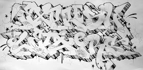
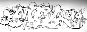
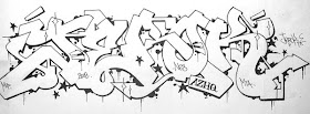
 Azhq (NES, MTA, MVP) from Amsterdam has some of the most classic letters in graffiti. His work seems to have continued directly out of the 90's with both traditional funk and legibility. Everything he makes is on point, peep game:

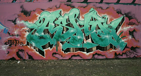
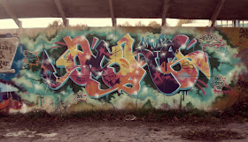
I like how different letters / fonts showing different shapes have different expressions like: Elegant, powerful, mean, solid, joyfull letters etc... That's why I like so many different letters & fonts. I like some old calligraphic scripts, the Chicano tattoo lettering, the Old English script, the baseball logo's, old design letters are mad hot, I like some fresh graff handstyles, I also like Neon letters a lot. I like how some designers make something new out of old fonts, like how they create logo's. Although I'm working in a traditional style of graffiti, ( I'm influenced by old school Amsterdam & old school New York City graff) I like to look at different fonts, even if it's some small elements or just the colors.
What Mediums do you primarily work with?
My graffiti sketches have been mainly drawn on paper using pencils & black fineliners, sometimes I use markers. I also do paint canvasses but it's primarily not graffiti or letter related.
How do you decide the thicks and thins in your letters? Do you have a system or any guidelines you use?
Partly it's because of the old school style I work in (I really restrict myself by doing that), but it has also to do with a calligraphic approach of my letters. I use to practice some calligraphic letters in the past. I'll wont do what a lot of new school graffiti artists do nowadays, switching the thicks & thins to the opposite way.In general my entire sketch has to be in balance including the thick & thins, but without being symmetrical (which influences where they go anyways). Besides thick & thins I look at the negative spaces between letters, it has to be balanced out and is almost as important as the shape of the letters itself.
How important is legibility to you?
It depends on the spot I'm going to paint, if it's at a side of a highway or trackside it has to be plain and clear letters, just visible. Simple fillins and readable letters. At other places I don't really mind. I'm not that keen on wildstyles though. I like connections, arrows, etc, but not covering the entire piece with too many things. The starting point has to be a good flowing letter. In general I like my color schemes to be really fresh, like color contrasts so it makes the piece pop off the wall. On the other hand I also like pieces done with a minimal color contrast, to bring the background and piece all together as one.
Sketches

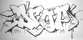


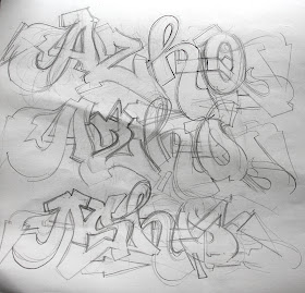 I usually start off with some rough sketching, it doesn't have to be well shaped, just looking for the 'right' letter and nice flow.
 I begin to sketch on a new piece of paper, going for the final sketch. I use the first sketches as a starting point. But little things change to make it look / flow better.
 The initial sketching is done, now I'll decide to give it an (fineliner) outline or just leave it this way.
 I draw the sketch over with a fineliner, it could be any color but overall I prefer black.
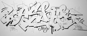 I've decided to do a shadow instead of a 3D. I add some bits, drips etc just to funk it all up a little.
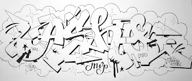 To bring everything together I put a cloud around the letters.
Inspirations | Azhq | Expresh Letters
Azhq | Flickr

No comments:
Post a Comment